 It’s crunch time! I’m revamping my portfolio site for my Multimedia Writing Course.
Here’s the first draft, which was done in the beginning of the semester: writerloanle.comoj.com
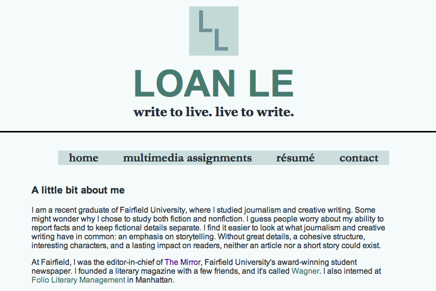
Here’s what it looks like now: writerloanle.comli.com
Today, I asked my classmates to test out my website. They’ve given me some great feedback, but here’s basically what they’ve said.
How should I open up my front page? Should I include the about me on the first page or create a separate tag for About Me?
They said it was fine to see a little bio on the front page. One classmate said, “It is a one stop shop for future employers wanting a quick summary of who you are.”
Should I include more buttons?
My classmates said yes and that I should make my social media content into buttons for the front page.
Easy to navigate?
My classmates said yes.
Other notes:
Should I include a picture of myself?
I notice other students have posted pictures of themselves on their sites. Some photos showed their professionalism and others showed off a more fun and relaxed side of my classmates. I wondered if I should include a photo, and most of my classmates said that it was up to me.

Leave a comment